Taking a Leap of Faith
Now that I have graduated college and am also employed, I felt the ambition to finally pursue my art business.
This is a leap of faith for me. I feel God is allowing me to follow through with this passion. I really enjoy selling my work to people at art festivals and inspiring others to create. Yes, this is very humble considering I went to college for Art and Spanish, but it speaks to my heart. Therefore, I must listen to my heart. The Holy Spirit is guiding me. I can’t ignore Him!
Self-taught Crafty Graphics
I have self-taught graphic design experience. While this type of experience gets overlooked in the professional art world, I can at least happily make my own graphics on the computer. This means, I don’t have to hire a professional when I want to execute something!
Though, whenever I do want to make something, I can’t make decisions on one particular design. This is why it took forever for me to make a true logo for my website. I’ve had my website for over a year, but I’ve struggled with designing a logo.
Throwing Out Ideas
I wrote down all of my ideas. One was to have a couple of paintbrushes around the word, “Art” but I thought that was too simple.
I had also wanted to incorporate my Salvadorian sun and moon into a logo. It was too hard for me to come up with a concept using them.
I then had an idea of a cutesy spider in the logo, but quickly thought against it because no matter how cute I think it is, people are terrified of spiders.
I struggled so much with my ideas. For a time I felt that had I taken graphic design, maybe ideas like this would be easier to execute. Then I would often remind myself of what awesome experiences I had taking printmaking instead of graphic design which made me throw away those regretful thoughts.
Light-bulb Moment
I finally sat down a few days ago to put an idea together. I wanted something that captured who I am as a person. I’m the face behind the art. I want my interests represented all across my website and in my pieces.
I looked at paintings I made, photos I took, wigs I enjoy wearing. I thought so hard, then finally! The light-bulb clicked on!
Materials Used
Since I’m working in the realm of digital art, my supply list is not as extensive as my other mediums:
- Wacom Bamboo Capture tablet pen--This makes drawing on the computer so much easier than when I spent several years using a mouse freehand.
- Macromedia Flash Pro 8--It is the only vector-based program I have. Yes, I know its old, but it works for me. It can do a lot without a heavy learning curve.
I needed a vector-based program for this design. Vectors are best for designs because you can increase or decrease their scale without damaging the quality. That’s great for logos, t-shirt designs, business cards, you name it!
Sketching
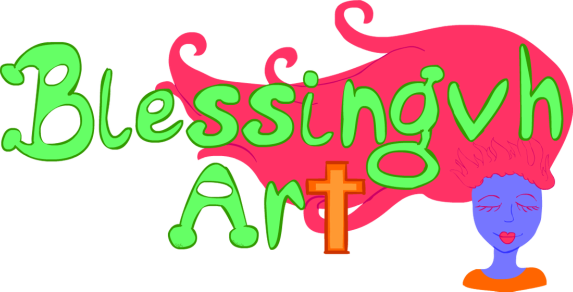
I wanted my site name to be strong text. I wanted people to be able to see it and read it from far away. I drew it on the computer.

I wanted the font to be comedic. I’m a pretty silly person.
Contemplation
After I made the text, I felt it was still empty. I know logos are not supposed to have so many bells and whistles, but I wasn’t happy with just words.
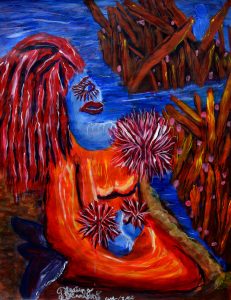
Then I remembered the light-bulb that went off a few days earlier! I wanted to implement the lady in one of the first paintings I made. The painting, “Alone at Sea” is of a blue woman who is staring off into the distance. Little does she know, there is a blue figure way in the background staring back at her, so she is not truly alone. It was made with acrylic on poster board.
This has been one of my favorite paintings due to how I prepared it; I kept pushing myself to finish it even when I was ready to give up. After learning how to paint by watching Karrie Evenson, I created four paintings in one summer. “Alone at Sea” was the fourth in that summer series! As I sketched the lady, I remembered why I made her hair so unique—it was because of how much I love wearing colored hair!

Since colored hair is a physical trait, people will always have comments on it. I used to care so deeply of what others thought of me. During college, I blossomed. I learned that my body is special. It is a gift from God.
I change my appearance because it makes me happy. Everyone may not like my hair or how I dress, but I do. I wanted my logo to show this aspect of myself. This lady’s bright red hair represents how I kept having to fight for myself and my decision to alter my appearance.
Last Minute Decisions
As I finished my sketch, I decided to leave it alone for awhile. I like to do that because I want to look at things with fresh eyes. I then started to draw the outlines.

As I did so, I remembered how much I have grown in my Christian faith. In my Youtube videos, I always try to incorporate a Bible verse at the very end. I really want to incorporate my spiritual growth in my art and blogs. So, I made the “t” in “art” be a cross.
I made her hair wavy and flow behind the letters. Her hair frames the letters loosely; it brings the viewer back to the center of the logo near the cross. I wanted her hair to flow as if the wind is blowing up against her. She is at peace as art brings me peace.
These are all decisions in composition. Composition is basically how a work of art is organized to evoke something from the viewer. I may talk more about composition in another blog. Believe it or not, art requires dozens of decisions.
Colors
Then I added colors! This is always the fun part for me because coloring in Flash is so easy.

You can literally scribble all over the place and it will only color the spotty selected areas. What a great, quick way to color!
A few hours later...

I have never been so proud of one of my own logos! The ones I’ve made in the past have always had something missing to them—not a lot of personality.
I like this logo because it is subtle while still portraying important things about me. I also really enjoy the fact that I used a previous painting as inspiration. Normally other works of art inspire me. This time, it was my own!
As I look at this logo, I think that even though I didn’t take graphic design classes, my self-taught skills are just as valuable. It makes me so happy to have something that is uniquely my own. I can’t wait to make business cards! This logo is so useful! I can also use the woman design as an icon. That way people can still associate it with Blessingvh Art.
This is the first step towards my business. I am determined to make this a reality. It would make me so happy to have my art fill people’s homes.
I just wish I could come up with a name for the woman. I’ve had this painting for years, but I tend to never come up with good names for my figures. Titles and names have always been a struggle for me…
Mañana, yo voy a compartir este artículo en español para mis vistantes latinos.
- October 20, 2016
Spook your friends with this chaotic blog!
Harmonic discussions from the kreepy castle
Get a 20% off discount code
We never spam because that’s gross!
